hi! i hope you're well (a greeting is important to me, okay!!!!)!
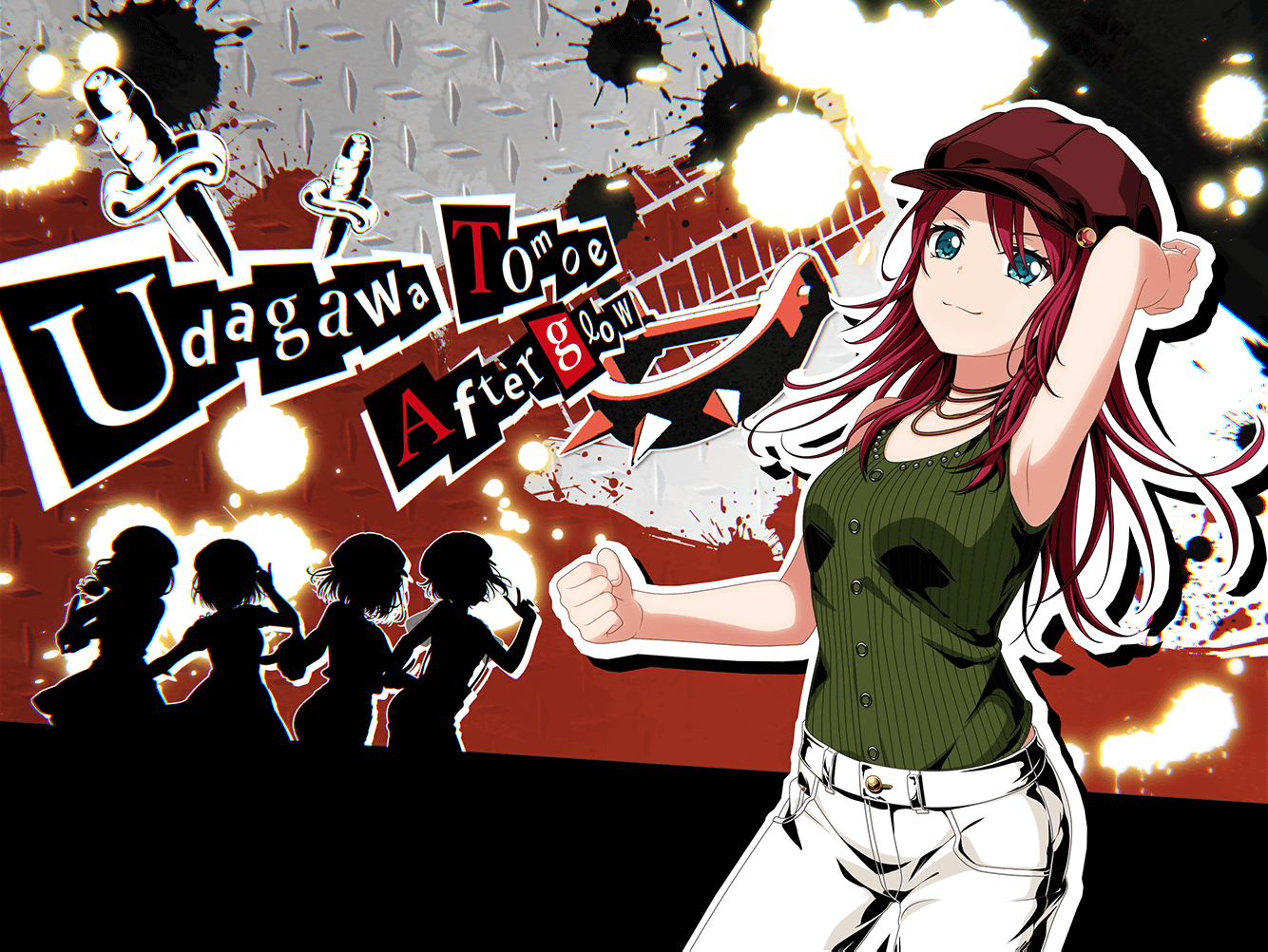
a lot of my friends say they don't get why the untrained art for the P5 collab cards is so... "bad," and since it sees like a fair amount of people here share this opinion, i'd like to go into why i believe the cards look so "plain jane" so-to-speak. i'll be using Tomoe's card as reference because i'm biased as heckle, so if you need to look at it a few times while you read this, keep it open in a tab!
please keep in mind that i don't much care for persona 5 personally (i'm sorry); i just want to help people understand why the untrained designs are likely the way they are.
this analysis will have spoilers for persona 5, so i suggest not reading this until you've beaten the game or finished an lp of your choice!!! if you'd like a rec for a playthrough, i suggest omegaevolution's! it's commentary-less and excludes all the "boring" parts of persona games (confidants/grinding/preparations, etc). all the puushes will be from his videos! this post is also rather picture heavy, so all of the pictures are links instead. sorry for making you do so much work, but i didn't wanna clutter the page.
first things first, the text half. it's mimicking the calling cards and general "text" feel of a ransom note the game often uses. a good example of this without having anyone sit through a 30m+ video is the calendar. it's one of the most important parts of the game; it shows the very important passage of time. another good place to see this is the general ui when you're just bumming around or are in a non-cinematic cutscene. as you can see, the date in the top left corner and the deadline numbers on the opposite side are using this kind of mismatched text.
in the bottom "corner" of the card, we have the rest of the band in silhouettes. this mimics the party ui when in battle (except the other ladies don't have costume markings and they're in casual clothes, but i imagine it's a shout-out to this). the confidant ui also uses a sort of version of this, except it's more detailed than the party ui.
lastly, the backgrounds all have references to the respective character's All-Out-Attack catch cards! the cards were cool as is, honestly, so the fact that the untrained art even acknowledged them is pretty sweet in its own right. due to being support, though, Futaba didn't get one, so Moca's card instead has some of the runes that can be found around Futaba's initial persona. here are direct links to each character the girls cosplay in case you don't know your persona [5] well: Ran / Himari / Tomoe / Tsugu
tl;dr:/in conclusion, while i do agree the cards do look boring and not as pretty as the trained arts, i'd like everyone to keep in mind there are a lot of elements from persona 5 used to keep the spirit of the game within the collab cards. they were incredibly well thought-out and not a single element in the untrained arts is misused or misplaced at all, which is incredible quality for a mobage collab. when you compare it to granblue fantasy's persona 5 collab, bandori's is honestly a lot higher-quality and a lot (A LOT) of time, effort, and passion (and maybe love?) was put into it. any less and, even as a person who isn't fond of persona 5, i'd have been upset.
...anyway, sorry for wasting a ton of your time and i appreciate you coming to my ted talk! have a good one! :D
also haru is best girl in p5 i am not willing to fight because it is very hard to pick


